BOLD STATEMENT
Kitchens are often designed to make a bold statement, but on occasions, the aesthetics can be compromised by the functional elements. However, that is not the case with this kitchen in a new home all the food preparation and cooking takes place in an adjoining scullery that can be hidden from view. Sublime Luxury Kitchen & Bathrooms designer Kim Duffin says the kitchen is in a very contemporary home, and the kitchen needed to make a design statement in its own right.
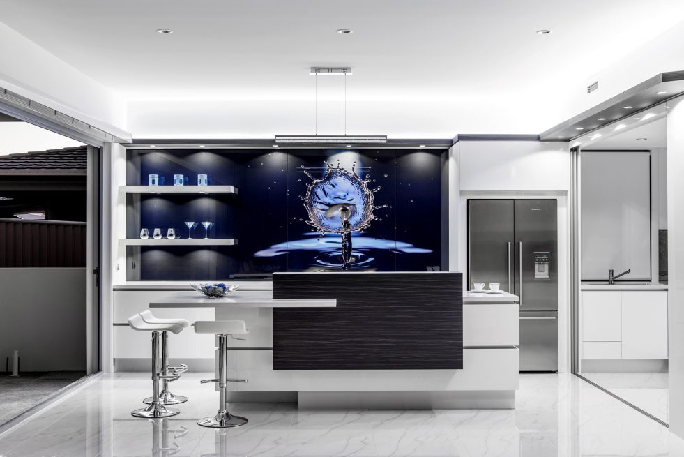
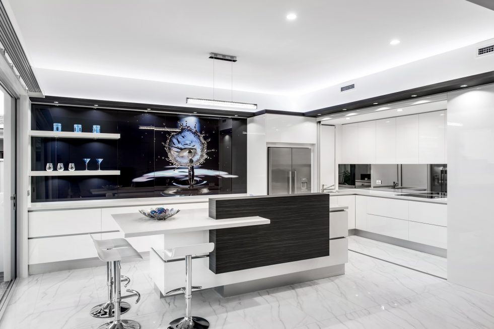
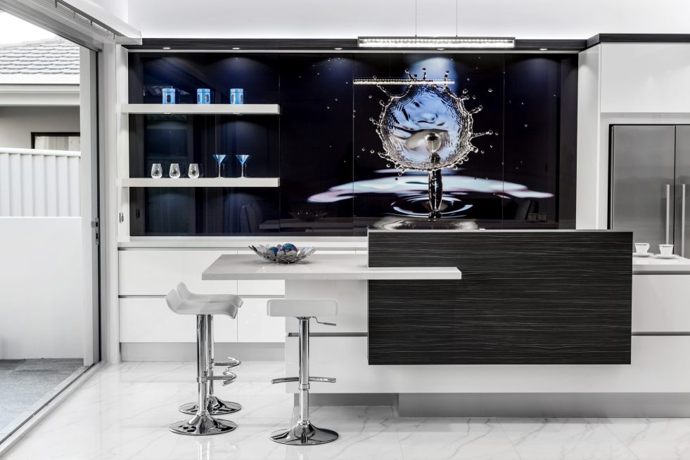
“Essentially the front kitchen had to be an entertainment centre, with no cooking at all,” he says. “In keeping with the design focus, the owners wanted to incorporate a permanent artwork. They consequently engaged an American artist who specialises in water drop artworks to create the splashback. This helped to determine the monochromatic palette.”
Project Details
Floor Plans
Project Information
Kitchens are often designed to make a bold statement, but on occasions the aesthetics can be compromised by the functional elements.
However, that is not the case with this kitchen in a new home all the food preparation and cooking takes place in an adjoining scullery that can be hidden from view.
Sublime Luxury Kitchen & Bathrooms designer Kim Duffin says the kitchen is in a very contemporary home, and the kitchen needed to make a design statement in its own right.
“Essentially the front kitchen had to be an entertainment centre, with no cooking at all,” he says. “In keeping with the design focus, the owners wanted to incorporate a permanent art work. They consequently engaged an American artist who specialises in water drop artworks to create the splashback. This helped to determine the monochromatic palette.”
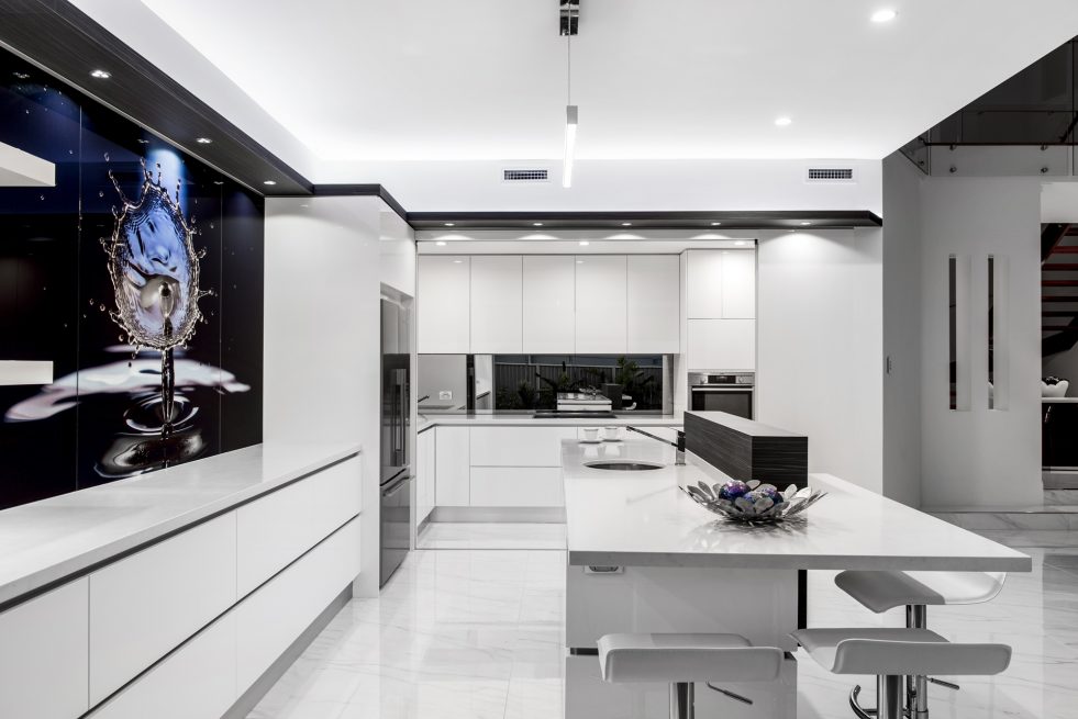
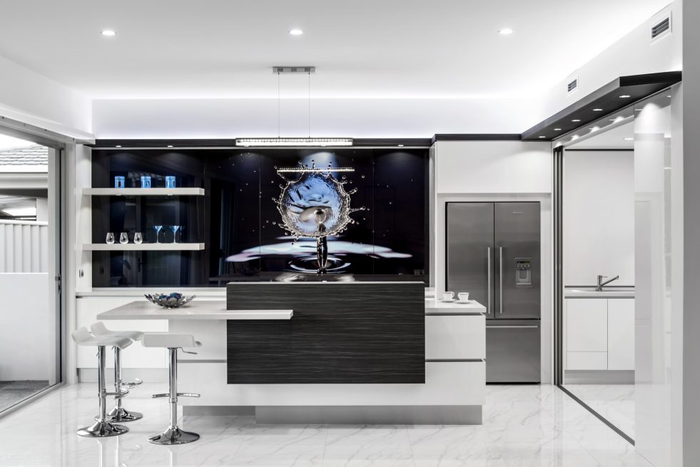
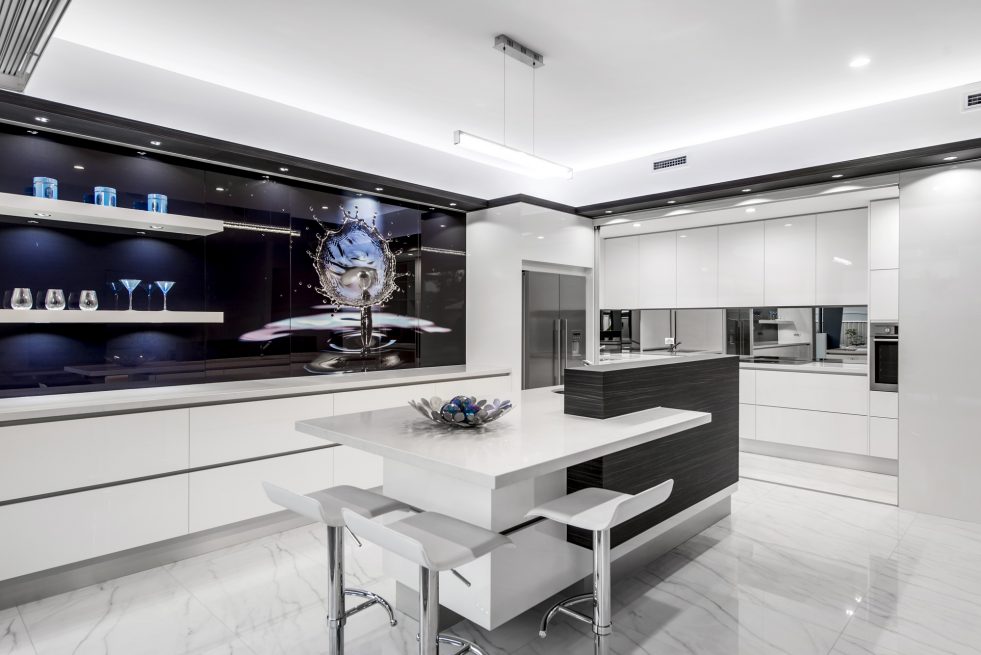
White lacquered cabinets are contrasted by a heavily textured wood laminate upstand that screens the sink area from the dining and family rooms beyond. The island benchtop appears to slice through one side of the upstand, creating an asymmetrical feature that echoes two floating white shelves on the splashback.”This kitchen is all about minimalism and a clean, uncluttered look,” the designer says.For this reason, there are recessed pulls on all the doors and drawers. An aluminium channel creates a matching horizontal negative detail on the front of the island. Duffin also created a timber flyover that wraps around the top of the cabinets. This features the same heavily textured veneer as the island upstand
“The flyover enhances the horizontal lines and helps to tie all the spaces together visually. It also accommodates accent lighting, with spots that highlight each of the four pocket doors that separate the front kitchen from the scullery. In addition, LED uplighting is integrated into the flyover shelf. This brightens the room and makes the ceiling seem higher.”The cabinetry in the scullery appears as an extension of the kitchen units. But the splashback here is mirrored, which helps to bounce light back into the room. Natural light is provided by a window, so the owners or caterers can work in the room with the doors closed.
Entertaining is also enhanced by large sliding doors that open up to the outdoors.
Project Video
Let’s Work TogetherGet In Touch
ContactLIKE OUR WORK ? – CONTACT US BELOW
