Concealed Kitchen Zones
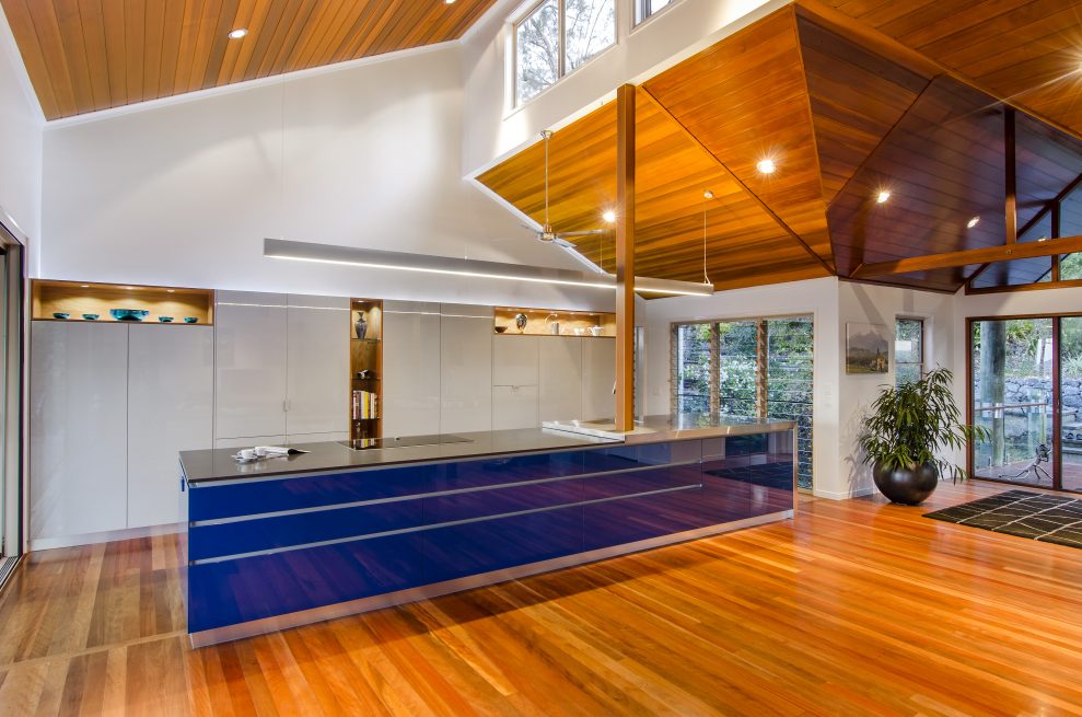
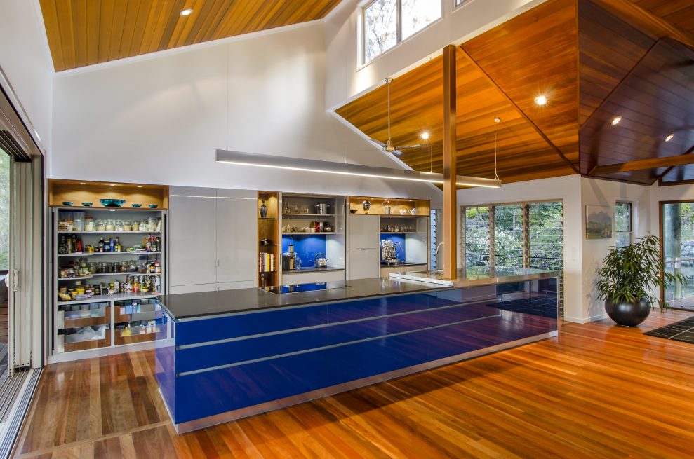
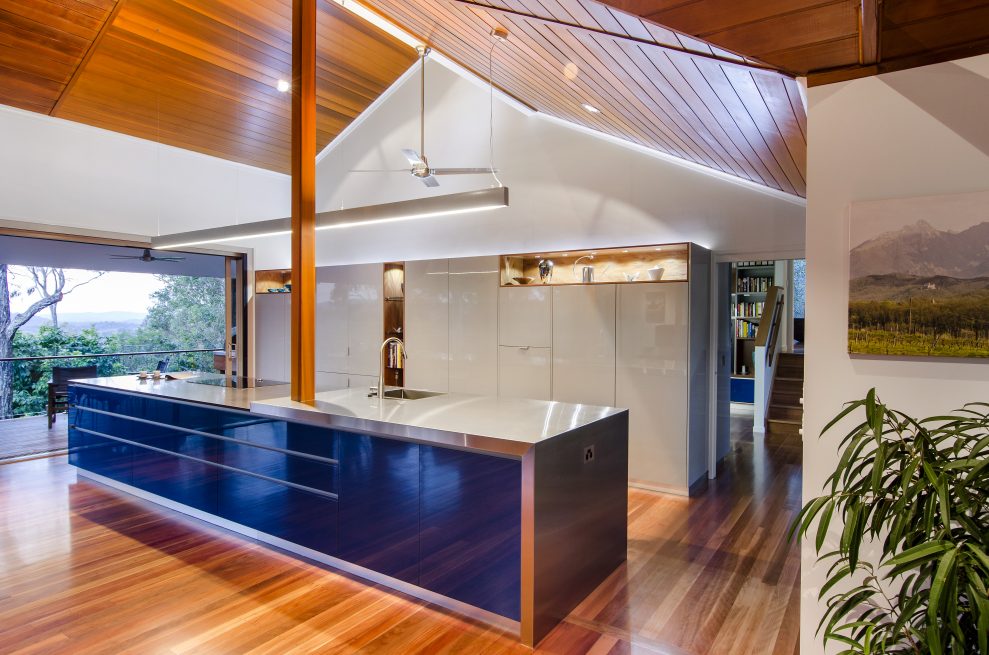
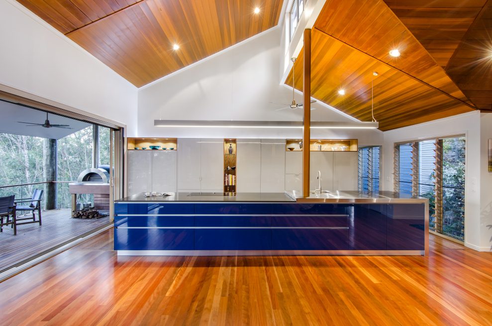
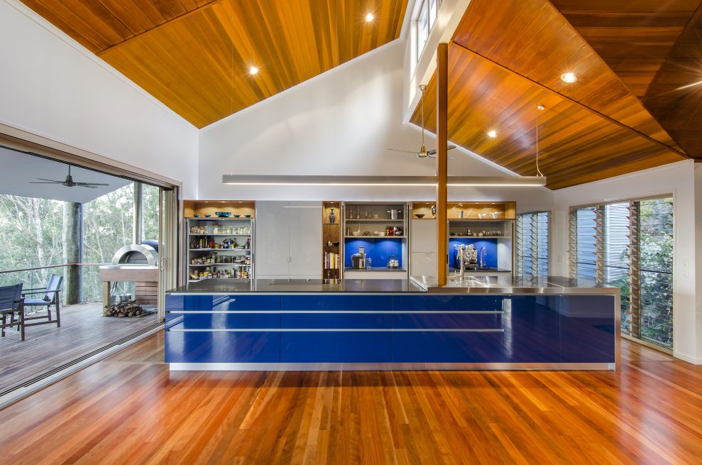
Designed more as a furniture piece rather than a kitchen, this kitchen space integrates all electrical appliances and through the use of Hafele concepta pocket doors conceals all the rear wall kitchen work zones from view when not in use. Accented with veneer open shelves and eye-popping back sprayed blue glass doors which looks good when not in use or when cooking up a storm.
Project Details
KEY FEATURES
KEY FEATURES
- Unique blend of materials and finishes
- Planned dedicated zones including ‐ Cooking, Food Preparation and Clean Up, Dining and Appliance Storage
- Effective Task, Accent and General Lighting Solutions
- Hafele Concepta Slide folding pocket doors to expose additional work benches
- Kitchen Integrates between all Spaces and Adjoining rooms
- Back sprayed glass adhered to the external drawer fronts of the island bench
- Blum Aventos HL Lift door to conceal existing microwave
- Blum Stainless Steel Intivo Drawers with frosted glass Sides
- 4 x Blum Stainless Steel Intivo Inner Drawers to Pantry with frosted glass Sides
- All Drawers to the inside of the kitchen fitted with Blum Touch open tip on mechanisms
- Designer coloured carcass and draw bottoms /Backs to match Stainless Steel Drawer Sides
- Differerent thickness benchtops to the island bench
- Custom welded stainless Steel Sink Bowl and Benchtop to the island bench
- Incorporation of LED Accent Strip lighting to recess above all tall cabinets
- Appliances positioned at practical height to suite users
- Elevated Fully integrated dishwasher for better Ergonomic use
Style of Home
Client Background
- Retired modern couple that likes to travel and explore new things
- Live 6 months of the year in Italy and 6 months in Australia
- Understand that their needs are changing as they are getting older
- They have embarked on the renovation/extension of their home to embrace their new needs going forward
Description of Home and Spaces
- Contemporary pole home situated hillside in Brisbane’s western suburbs
- Mixture of materials to the exterior of the home with large decks opening to the east to take advantage of the hilltop position and views
- There is no segregation between kitchen, dining and living room.
Client Breif
Project Challenges
- Australian standards with reference to glass manufacturing
- Rangehood to be excluded from the design
- Pocket door hardware to withstand constant use
Client Brief
- Dedicated multitask zones
- Kitchen that felt more like furniture
- Dedicated area for Chopping
- European flair and styling
- Segregated area for small appliances
- A splash of sophisticated colour to be used in the kitchen space
- Use a combination of materials that will complement the adjoining living spaces and marry together well across the space
- Consider the heights of appliances to reflect a mature end user
- Create lighting solutions to enhance the design and usability of the zones within the kitchen.
Design Statement
Thoroughly modern is the best way to describe these mature clients. Extensively enjoying their retirement by living 6 months in Australia and 6 months at their villa in Italy, this couple wanted to incorporate their much loved European lifestyle into their home here in Brisbane.
They decided to extensively extend and renovate their home to enhance the areas that they, as couple, use and enjoy on a daily basis. Therefore the home was extended from the existing kitchen space, now the dining and living rooms, to create a new kitchen, library and master bedroom retreat.
The current European trend of “furniture” being used in the kitchen is something they wanted to emulate in their new spaces here in Australia. The new galley style design with its single island and bank of “storage” cupboards behind creates a strong linear look which is sleek and clutter free. With the use of brushbox timber throughout the kitchen shelving a strong marriage between the living, dining and kitchen is created and encourages the look of individual furniture pieces.
The touch open drawers used throughout the kitchen also keep the space sleek and uncomplicated while maintaining the lines and flow of the space.
The action packed large island is definitely the main visual and functional feature in this new space. Housing both the sink and the cooktop, most of the day to day action happens around this hub. Visually, many textures, colours and surfaces have been used to create purpose. The induction cooktop is housed in a seamless piece of Ceasarstone which then flows effortlessly into the custom made stainless steel benchtop that houses the sink. The stainless steel then continues, falling gracefully to the timber floor, grounding and connecting the island piece to the rest of the space.
The strong presence of this island continues with the glass fronts that have been directly attached to the drawers and fixed panels at the front of the island. Having the Australian Standard in glass manufacturing stating that measurements can be +/- 2mm, it was not an option to have each piece not be exact. Therefore, every cut was made via a CNC then back sprayed in the chosen colour. The edges were also mitred to the corner pieces of the glass to ensure the flow continued.
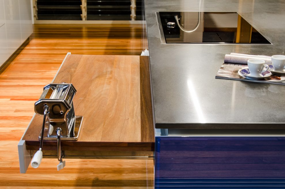
Both owners of this home enjoy preparing many culinary delights, from scratch, therefore a large custom made Brushbox timber chopping board was incorporated into the design. It has been housed in the island using a standard tandem box drawer runner. It can then be pushed out of sight once the preparation has been completed so no need to lift it off the bench and into a drawer or cupboard.
When the kitchen is in full use the doors on the rear cupboards can be effortlessly retracted fully to reveal many work “zones” such as the pantry, fridge, sink and small appliances. With all the main day to day action happening on the island these doors can be closed to minimise the distraction to the kitchen user working on the island. The heights of appliances such as the dishwasher and microwave were carefully considered when designing this new space. The users wanted to ensure that the functionality and practicality of the space would continue for many years to come as they begin to enjoy their twilight years. The dishwasher was placed 576mm off the floor and the microwave just above the dishwasher. This would enable the user to move plates, bowls, cups etc directly from the island and into the appliances effortlessly.
The blur between spaces was an important element for the clients to achieve therefore they were adamant that they did not want to install a hood over the cooktop positioned in the island bench. As this is greatly frowned on, much discussion was had to justify the exclusion of this appliance. Another element that made the inclusion of a rangehood difficult were the raked ceilings featured throughout the space. However, the height of the ceilings and the excellent cross ventilation available enabled Kim to continue designing the space without the inclusion of a rangehood.
Environmentally friendly lighting has been applied extensively throughout the design. It all starts with the LED cool white strip and downlights run above the overhead cupboards through the kitchen and pantry and under the inbuilt dining table. Extensive LED downlights are used throughout the kitchen to create adequate task lighting. Kim sourced the pendant light hanging over the island bench. The light was used as it provided both upward accent light and downward task light to the island bench.
Seeing a kitchen space defined with furniture pieces is definitely a strong trend coming out of Europe, Therefore for clients that divide their time between here and the continent, designing a space that incorporates this trend was a must. No matter where they call home they will have the same ease of use for many years to come.
Floor Plans
Project Video
Let’s Work TogetherGet In Touch
ContactLIKE OUR WORK ? – CONTACT US BELOW
