Consideration to All Adjoining Spaces
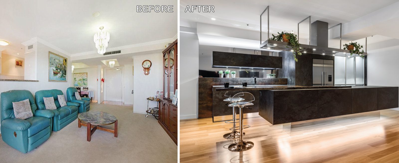
Sublime Architectural Interiors can assist with apartment kitchen renovations. The original layout of the kitchen was typical for apartments built over 20 years ago. The space was restricted by a collection of small rooms, two dining areas plus a kitchen that did not take advantage of the views or the need for a strong connection between living areas and the outdoors. The new design has managed to still give definition to activities performed in the kitchen, dining and living but through minimal detail, the kitchen does not dominate the space which can often happen in an open plan.
Project Details
KEY FEATURES
KEY FEATURES
- Consideration to all adjoining spaces
- Removal of dining and kitchen room walls to provide a more open plan feel and illusion of more space
- Extension of the kitchen area into previous formal dining area
- All spaces within the now large open plan repreportioned ‐ giving a larger single dining area positioned to maximise the view
- Consideration to existing ceiling bulkheads and the impact on air‐conditioning ducts
- Half height services wall planed to allow relocation of services (restricted to a single exit point being an apartment)
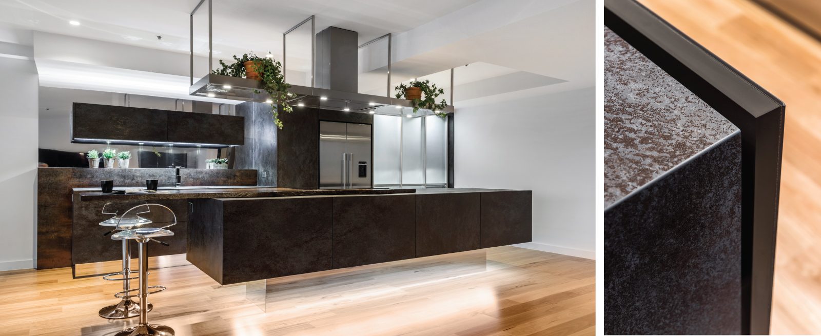
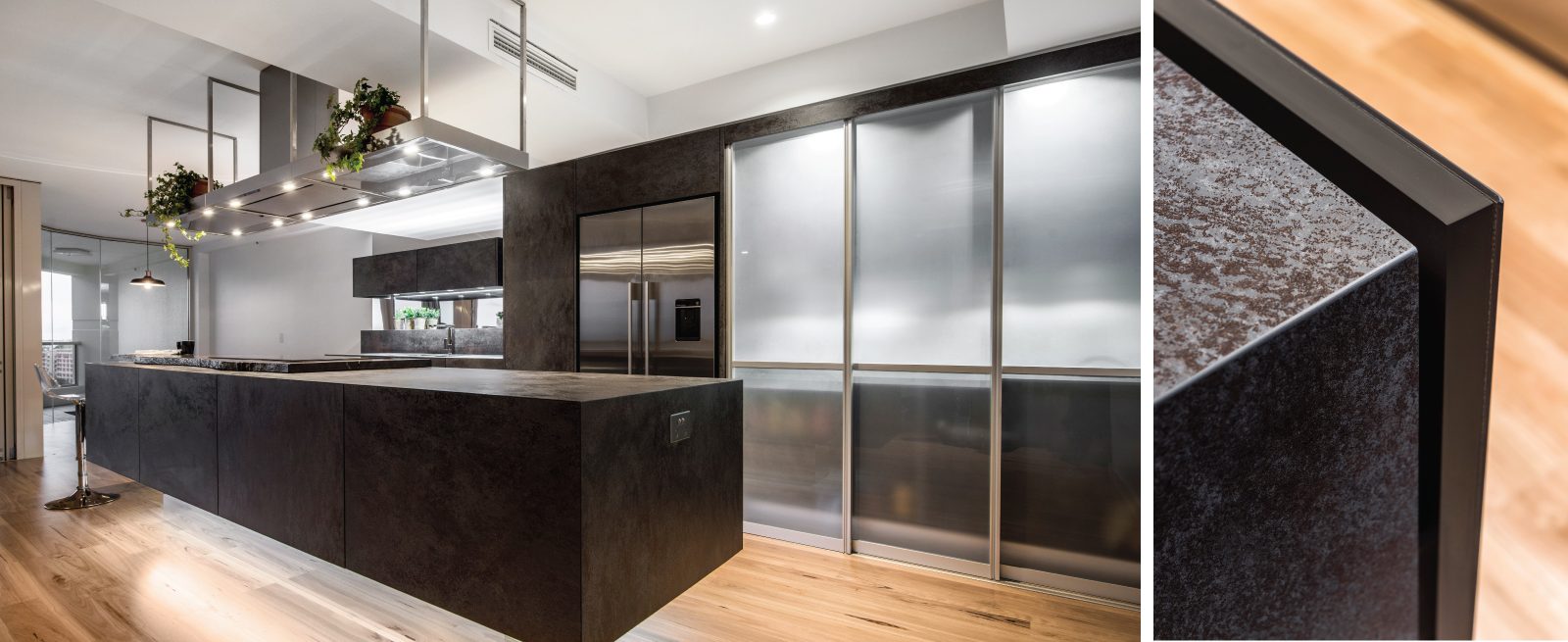
- 3mm Laminam (porcelain Sheet) clad to 16mm Formica Asphalt melamine Substrate to all drawer fronts
- 3mm Laminam (porcelain Sheet) clad to 16mm Formica Asphalt melamine Substrate to all Benchtops Benchtops and Panels
- Mitre detail junctions where drawer fronts, Benchtops and end panels meet
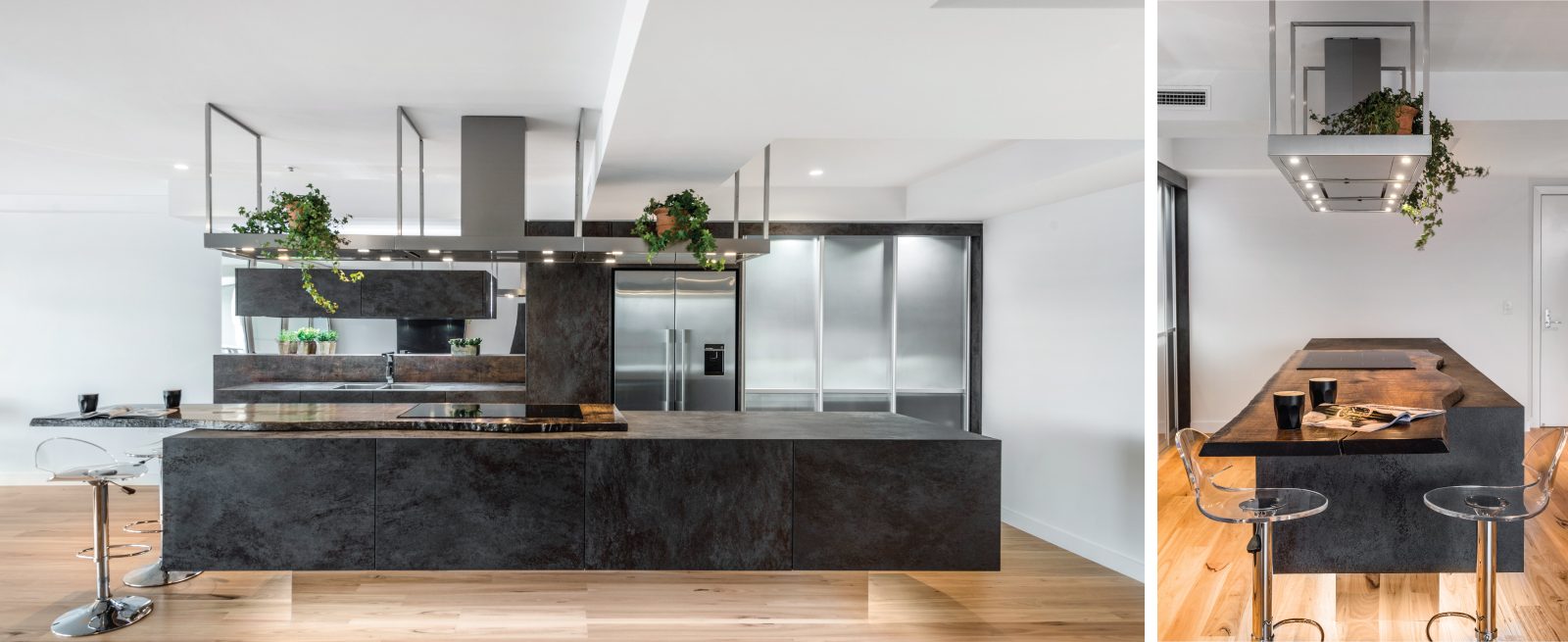
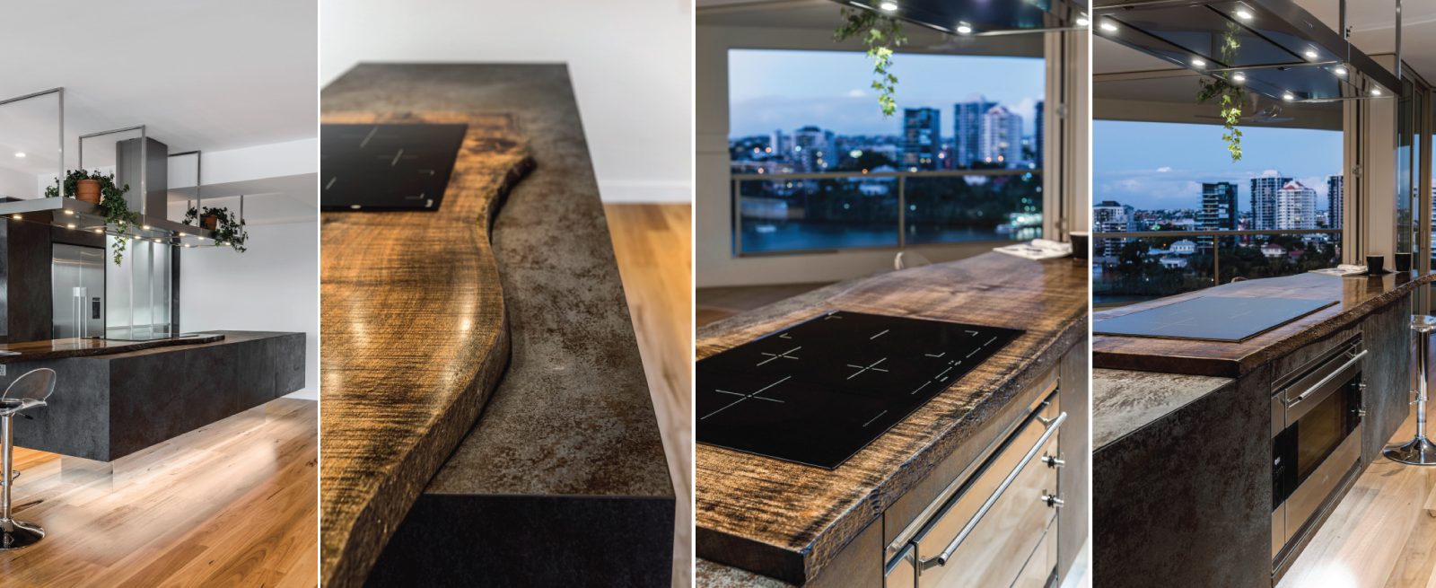
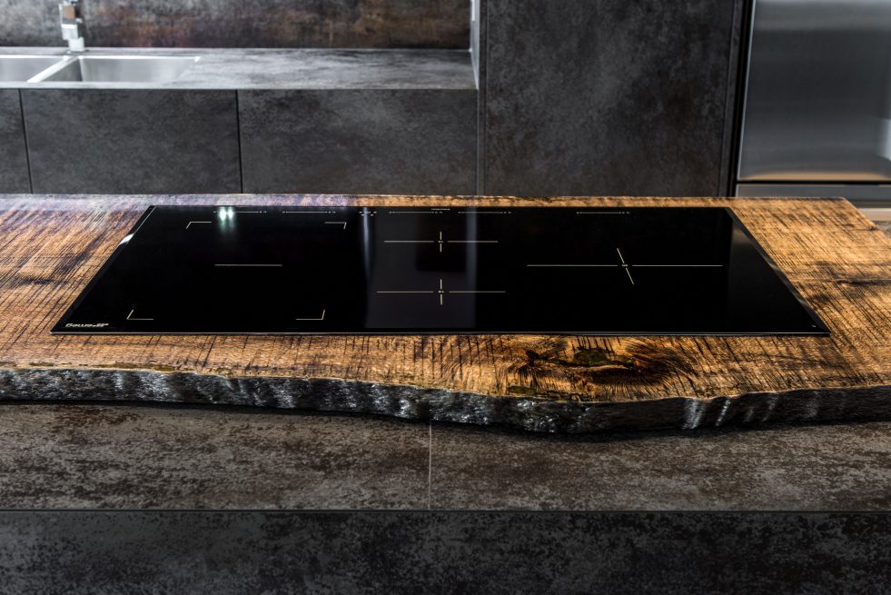
- Timber rough sawn Silky Oak Feature Benchtops to the island ‐ to provide small breakfast area ‐ increased bench space and soften the harsh finishes
- Fully imported SMEG European Appliances
- Fully Imported Falmac Stainless Steel Range hood Flyover ‐ to recirculate the range hood, provide storage and task lighting to the island bench
- Coloured Melamine Designer Internal Carcasses
- Use of Metaline Reflections Surfaces (Mirror) to splashbacks to reflect light back into the space and capture the external views
- Use of Metaline Reflections Surfaces (Mirror) to Kickboards to create an illusion of more floor space and floating feel to the island
- An achromatic colour palette with warmth created by the addition of timber elements
- Consideration of natural light and the aspect of the space
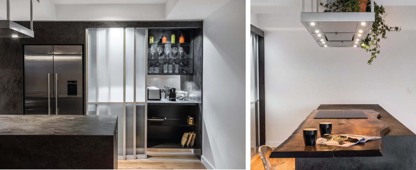
- Storage for Small appliances ‐ by sharing traditional zones and providing a bench top storage space to a traditional Pantry.
- Aluminium Frame Sliding Credenza Doors and recessed floor mount track for easy accessibility and cleaning
- Energy Efficient LED Diffused Accent Strip Lighting ( recessed back 75mm and positioned around the perimeter of the overhead cabinet)
- Energy efficient LED Diffused Accent Strip Lighting (under the island bench joinery to aide the floating illusion)
- Energy efficient LED Task Down lights (positioned under all overhead cabinets including the pantry)
- BLUM Stainless Steel full extension Intivo Soft close Drawers
- BLUM Servo Drive Electrical Opening Support System to all drawers (to aide opening drawers due to increased weight of porcelain)
- Blum Aventos HK Lift Systems to Doors ‐ to doors above fridge and overhead cabinets
DESCRIPTION OF HOME
DESCRIPTION OF THE APARTMENT
- 2 Bedroom, 2 bathroom inner city high rise built in 1990’s
- 12th floor position in a building with only 4 apartments per floor
- CBD, River and stunning views to the Kangaroo Point Cliffs
- Living spaces and bedroom open to balcony facing east
- Combination of aluminium Frame Windows, sliding door and bi fold door
- Apartment fully renovated with layout modifications to living and wet areas
CLIENT BRIEF
CLIENT BRIEF
- Open up to create a better flow between kitchen, living and dining as well as the outdoor living space
- Space, space and more space ‐ being an apartment the effective use of space is paramount
- Allow the kitchen user to have a greater connection with the extensive river and city views
- Contemporary Minimalist look and feel
- Focus on the functionality of the storage systems used in the design
- Provide a home for all kitchen appliances, cutlery, glassware and cookware that would be easily accessed and rehoused after use
- Warm timeless hues to be used to create the colour palette in the space
- Allow the spaces to come alive both day to day and during entertaining
DESIGN OBSTACLES AND PROJECT CHALLENAGES
- Structural Wall – Although all other walls were removed from the kitchen space there was a structural column that could not be removed from the centre of the rear wall of the kitchen
- Air‐conditioning ducting – Like most apartments the air conditioning head units and ducting are attached to the ceiling with false ceilings constructed out of plasterboard to house them. This apartment was no different; therefore retaining some of the false ceiling was a necessity to the design as well as taking into consideration the vents
- Services – In addition to providing power to the centre island, we needed to create spaces to house all the services required for the new design
DESIGN STATEMENT
DESIGN STATEMENT
This sky home with stunning views over Brisbane’s CBD, the river and Kangaroo Point Cliffs captures the maturity now found in inner city living in Brisbane. Originally from Melbourne and with his experience gained from extensive business travel abroad, the owner of the apartment decided to transform his home to match the cosmopolitan lifestyle he has enjoyed whilst living in these locations.
The original layout of the kitchen was typical for apartments built over 20 years ago. The space was restricted by a collection of small rooms, two dining areas plus kitchen that did not take advantage of the views or the need for a strong connection between living areas and the outdoors.
The new design has managed to still give definition to activities performed in the kitchen, dining and living but through minimal detail the kitchen does not dominate the space which can often happen in an open plan.
A typical galley kitchen design was selected as it best catered for how the space relates to the rest of the apartment and adjoining living space. An effortless workflow is created from the start point of the pantry, housing food stores as well as small appliances, and refrigerator. These are within easy reach of the preparation zones and cooking on the island. Then delivery to the dining area is seamless.
There are a number of key features used in the design to create the feeling of spaces whilst maximising functionality. The mirrored kickboards reflect light (aided by the use of LED strip lighting to the underside of the cabinets) creating the illusion that the cabinets are floating thus reducing the footprint in the design.
The simple design philosophy is continued with the use of Laminam, 3mm porcelain sheets to the vertical and horizontal surfaces. This material is then mitred on the edges of all drawers and doors exaggerating the seamless, minimalist, cube look. A cantilevered bespoke silky oak timber benchtop placed on the island creates a small breakfast/coffee area whilst increasing bench space and creating the illusion of more space. The stain and other features of this unique piece of timber
compliments the tones found in the porcelain skin of the kitchen.
The half wall built behind the sinks hides the entry point of the services into the apartment. This has been clad in a complimentary laminate for the timber benchtop . Mirror splashbacks help reflect more light into the space. The cabinets above the cleaning zone also appear floating due to the mirrored surface behind and the placement of LED strip lighting used to highlight the perimeter.
A fully imported FALMAC Stainless Rangehood and flyover compliments the plasterboard bulkhead that houses the air conditioning whilst providing task lighting to the island. Lighting has been used throughout the space to highlight and frame the design elements whist creating illumination for all tasks completed in the kitchen.
Achieving “fluid motion” has been a major influence in the choice of hardware used in the design. Blum servo drive electronic drawer opening systems have been used to counteract any issues that may be encountered by the added weight of the porcelain used on the drawer fronts. These are then married with Blum Intivo soft close drawer systems.
The devil is in the detail with a design and space that is so low profile yet complicated in it’s simplicity.
FLOOR PLANS
Let’s Work TogetherGet In Touch
ContactLIKE OUR WORK ? – CONTACT US BELOW
