Wavell Heights Kitchen Renovation
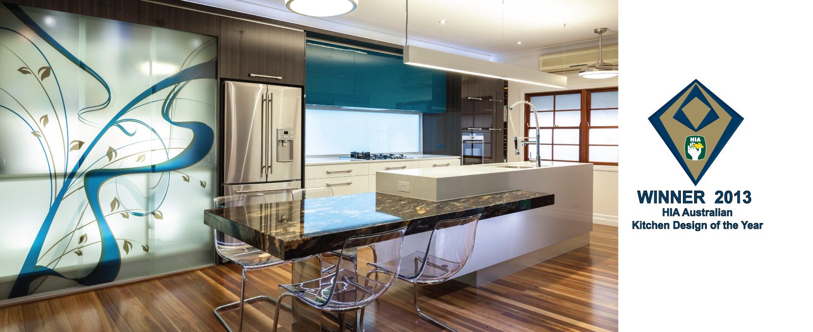
Like any renovation, transforming the space is always a given, however, creating a place that a busy family can rely on as the point where they all come together and participate in each other’s lives is the end goal every designer dreams of. This project provides these opportunities for this family in spades. They now have a space that is sophisticated, uncluttered and suited to how they enjoy their time together.
Project Details
PROJECT FEATURES
PROJECT FEATURES
- A unique blend of materials and finishes
- Planned dedicated zones including ‐ Cooking, Food Preparation and Clean Up, Dining and Appliance Storage
- Effective Task, Accent and General Lighting Solutions
- Innovative face printed and backlight custom designed graphic to hutch doors
- Kitchen Integrates with all Spaces and Adjoining rooms
- Bold Feature Hafele Handles
- Blum Stainless Steel Tandem box Plus Drawer Sides
- Blum Aventos HF Lift Mechanisms to all overhead cabinets
- Blum Aventos HL Lift door to conceal existing microwave
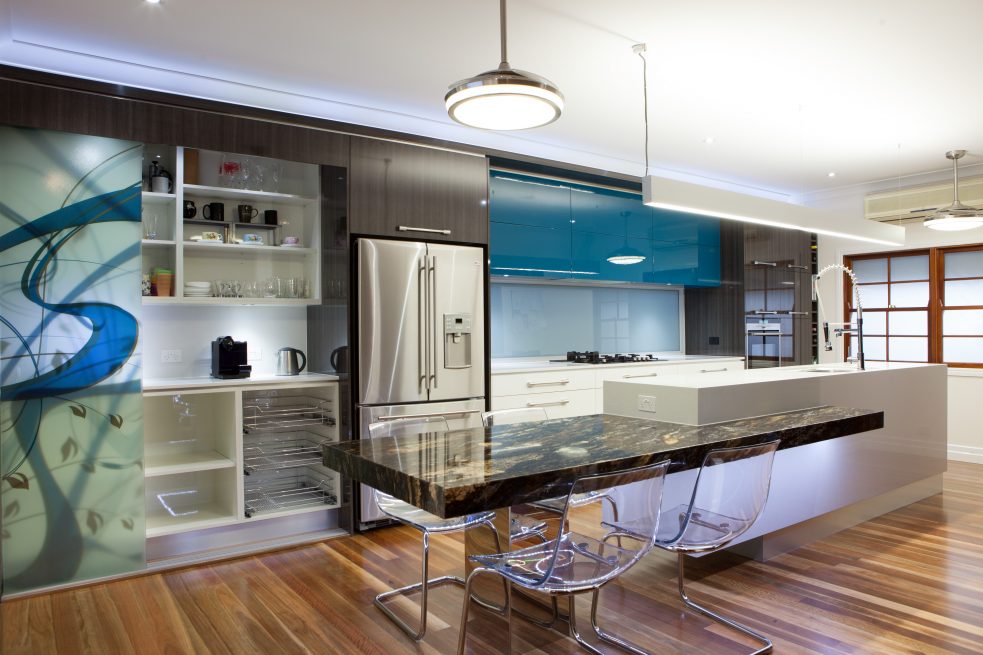
- 3 x Chrome Baskets to Appliance Credenza
- Aluminium Upper Shadow line detail above tall cabinets and below laminated ceilings
- Aluminium Bench top Shadow line detail
- Kitchen Flows to the outdoor alfresco
- Appliance Credenza Area to be included to conceal small appliances
- Coloured drawer bottoms and backs to match Stainless Steel Drawer Sides
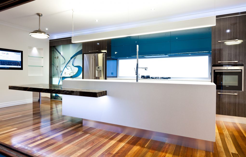
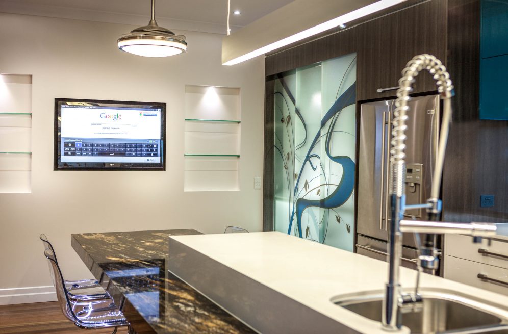
- Integration of Wi‐Fi Ready TV for searching for recipes
- Orion Granite bench top mitred and book matched fascia, supported on Mirror Clad Column and substrate to give a cantilevered feel
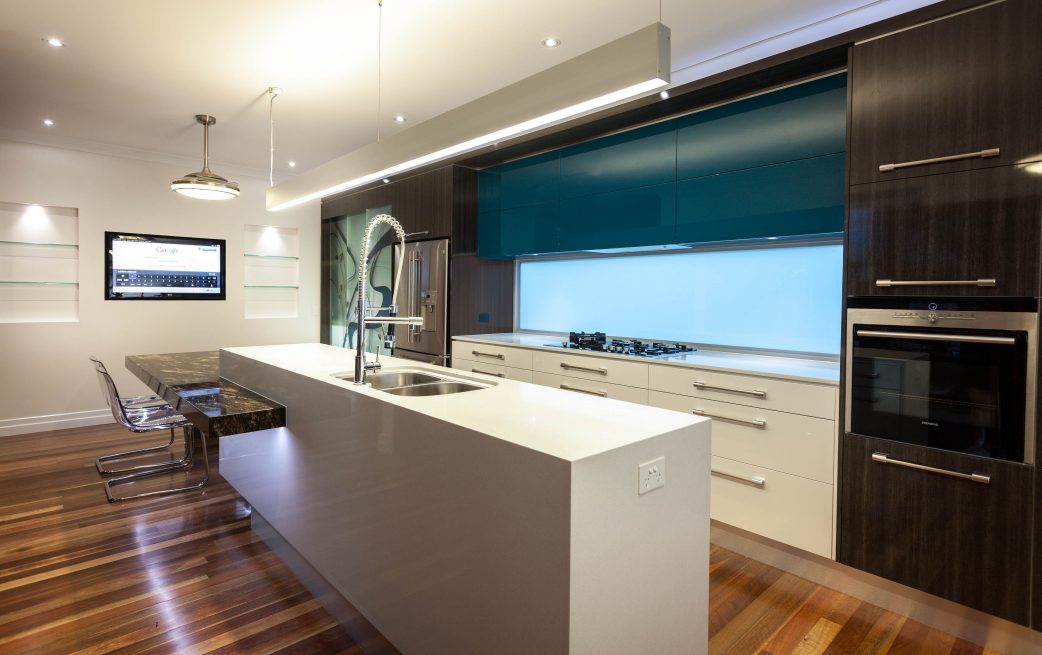
- Mitred Ceasarstone Cube to Island front and ends
- Incorporation of LED Strip lighting to the edge of the table
- Integration of LED Accent Strip lighting to recess above all tall cabinets
- Appliances positioned at a practical height to suit users
Client Brief
CLIENT BRIEF
- Gain more bench and storage space
- Cookbook storage
- A functional layout that is conducive to activities such as baking and cooking
- Incorporate a built-in Smart Television
- The design must take into consideration stage two of their renovation which will be the enclosure of the adjoining patio area. It will become the dining and family rooms
- A splash of colour – match to an existing feature wall in the stairwell and to bring a sense of
muted fun to the kitchen space - Use a combination of materials to diversify the area
- Capture the eastern morning sun
- Bench heights to be positioned at the most ergonomic height for the end user
- Create lighting solutions to enhance the design and usability of the zones within the kitchen and
other spaces - Create space in the kitchen for informal family dining
- Existing microwave to be used
- Ceiling fans to be in the kitchen
PROJECT CHALLENGES
- Engineer needed to be consulted with reference to the removal and relocation of the window located on the back wall of the kitchen
- Plumbing and electrical needed to be relocated to achieve the best design outcomes and functionality for the family
- Husband and wife differed on their tastes when it came to the colours and finishes used in the space
- Creating a custom design that suited the clients taste for the digitally printed glass doors to the credenza
- Locating a suitable door/system for the glass doors to the credenza that were frameless to not obstruct the flow of the pattern across the doors
- Take into consideration the position of the custom design
Design Statement
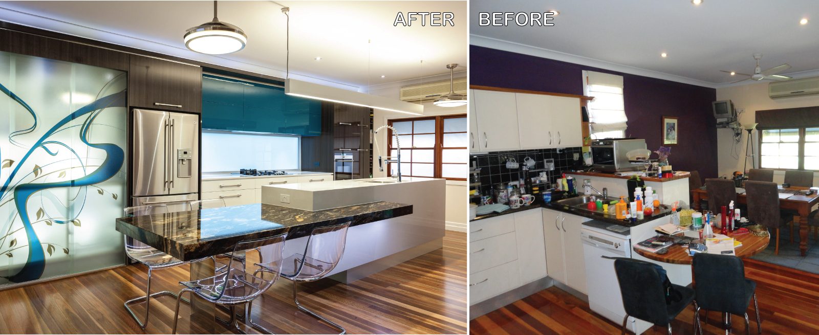
Upon visiting with the clients, it was evident to see that they needed more bench space, more storage and a better flow than their current kitchen provided. It was a typical closed in “U” shaped space with a small meals area. Not an inch of the bench could be seen. With the clients wanting to embark on the full renovation and modernisation of their home, they had decided to tackle the kitchen first. As in most homes, the kitchen is the hub of the house and for this family that is undoubtedly what the kitchen represents. They start their day together watching Sunrise, eating breakfast and planning their day. Then with lunches packed it is out the door. Through the day Mum is looking online at the latest recipes or ordering groceries with the family regrouping around the kitchen to watch the nightly news over dinner.
Stage two of their planned renovations include the enclosure of the adjoining patio to become the dining and family room so this gave licence to merging the existing kitchen and meals into one space that would provide a new area that was free from clutter and create flow and balance in their daily lives. Every family needs a useful space in the hub of the home as it creates harmony and can help them operate more efficiently as a family. In this design, Kim has made moving between tasks effortless. From the conception of what will be served for dinner, which is researched via the designated cookbook storage or via the Smart TV, to selecting the ingredients from the pantry, preparation on the island, cooking then delivery. The flow created in this design is simple yet effective.
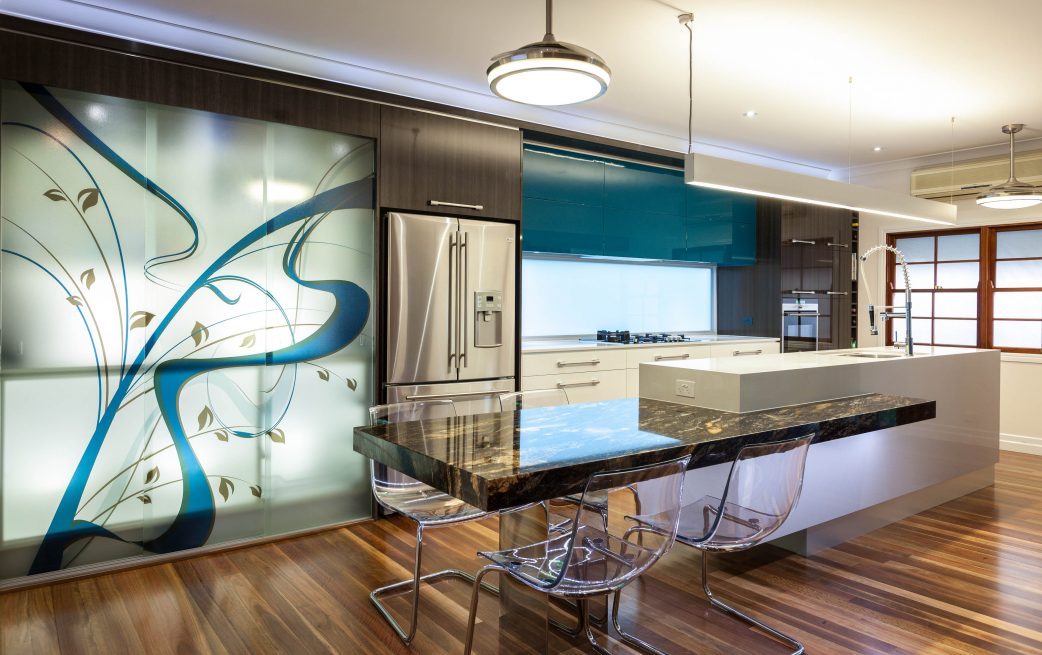
This tech savvy family needed to incorporate their Smart Television into the design. They use their iPhones to drive the TV and use it to find the latest recipes, watch morning or afternoon television, share photographs from their day and catch up on current affairs. The television needed to be in a position that could be easily seen from all areas of the kitchen but not the main feature of the space. So embedding it in the end wall made it visible yet invisible to those entering the kitchen. Even though this is the home of a young family, the seamless caesarstone clad island provides an element of sophistication to the space. It gives a secure core to the design and helps encourage flow and simplicity to the user of the area and throughout the space. The granite table top featured at the end of the island was selected by the clients and provides an informal zone for the family to dine and catch up. The top is supported by one mirror finished square post. This mirrored finish gives the illusion that the top is “floating” and keeps the space light and free flowing. The chairs, Kim selected to complement this built in table, also aid in this illusion and do not detract from the lighting under the top and the beauty of the granite.
The credenza was included to provide the family with additional storage for items used in the serving of foods and other ancillary items. To help tie this furniture piece into the kitchen, Kim decided to use the front to encourage the colour, Dulux Porpoise Place, to integrate fully in the space. Kim designed a graphic that would incorporate this colour yet not be too loud that it would burden the space. This graphic was digitally printed onto the frameless glass doors; this design was carefully created and placed not to be interrupted by the finger pull detail required to open the doors. For easy access to utensils, cutlery and other kitchen items Blum stainless steel soft close drawers and aventos lift system doors to overhead cupboards were used throughout the space. This feature brings the kitchen to the user and helps create strong horizontal lines. The clients had a requirement of using their existing microwave, so an aventos lift system door was used to conceal this appliance from view but to give maximum access.
The plumbing was relocated to enable the sink to be moved to its new location in the island, and additional power supplies to the island bench were brought through conduct lines that were laid in newly created trenches in the concrete slab. The new galley style design allows for the future inclusion of a newly created dining and family living space. These additional spaces will be completed in stage two of the renovation, so Kim needed to envisage how they were going to be used and the ability of the kitchen to service these areas. The kitchen can be accessed from several directions and will merge seamlessly with its adjoining spaces. With the only window to the new space facing south getting natural light was another important function to fulfil in the design. With the back of the kitchen facing east, it was essential to capture the morning sun for as long as possible. There was a small existing window, awkwardly placed in the back wall of the current space, so after consultation with an engineer the window was repositioned and increased in size to provide a portal to the natural light produced by the sun streaming in the morning. The sun from this direction now floods the kitchen with natural light at a much needed time in the morning.
Environmentally friendly lighting has been applied extensively throughout the design. It all starts with the LED cool white strip and downlights run above the overhead cupboards through the kitchen and pantry and under the inbuilt dining table. Extensive LED downlights are used throughout the kitchen to create adequate task lighting. Sublime Luxury Kitchen & Bathrooms sourced the pendant light hanging over the island bench. The light was used as it provided both upward accent light and downward task light to the island bench. Having access to good cross flow of air was another important inclusion that the clients wanted for their new kitchen. Using ceiling fans in a kitchen space can often overpower a space. However, Kim decided to use retractable bladed fans that were also very stylish lights. These lights complement the pendant light and provide a simple, uncluttered solution to fans in a kitchen.
Like any renovation, transforming the space is always a given, however, creating a place that a busy family can rely on as the point where they all come together and participate in each other lives is the end goal every designer dreams of. This project provides these opportunities for this family in spades. They now have a space that is sophisticated, uncluttered and suited to how they enjoy their time together.
Floorplans
PROJECT VIDEO
AS FEATURED IN
AS FEATURED IN HIA AUSTRALIAN HOUSING WINNERS MAGAZINE
Let’s Work TogetherGet In Touch
ContactLIKE OUR WORK ? – CONTACT US BELOW
